Documentation
Helpdox, start to finish
Install the theme, import a demo in one click, then make it yours: a knowledge base with instant search, tickets, changelog, roadmap, status page and 33 elements that work the same in Elementor and the block editor.
Start here
01Getting started
Helpdox is a help center, knowledge base and customer support theme. The theme handles the design. The bundled Helpdox Core plugin adds the docs, search, tickets, changelog, roadmap, status page and 33 elements, and each element works in both Elementor and the block editor.
01.1Requirements
| What | Minimum | Notes |
|---|---|---|
| WordPress | 6.5+ | Tested up to 7.1. |
| PHP | 7.4+ | PHP 8.1 or newer is faster. |
| Elementor | Free version | Needed for the six demo homepages. Docs, tickets and every element also work with the block editor alone. |
| Permalinks | Any “pretty” setting | Docs live at addresses like /docs/product/category/article/. Plain permalinks (?p=123) are not supported. |
| Memory | 128 MB | The demo import runs in small steps, so budget hosting works. |
01.2What is in the download
| File | What it is |
|---|---|
helpdox.zip | The theme. Upload this one in WordPress. |
helpdox-child.zip | An empty child theme for your own code changes (optional). |
Plugins/helpdox-core.zip | Helpdox Core. A copy is already inside the theme, so you never upload it by hand. |
Documentation/ | This guide, for reading offline. |
Licensing/ | GPL license and credits for fonts and libraries. |
01.3Install the theme
- Go to Appearance›Themes›Add New Theme›Upload Theme.
- Choose
helpdox.zip(not the whole download) and click Install Now. - Click Activate. A notice asks you to install the required plugins. The next topic covers it.
If you see “The link you followed has expired”, your host limits upload size. Ask the host to raise upload_max_filesize to 16 MB, or upload the unzipped helpdox folder to wp-content/themes/ by FTP.
If you plan to change theme code, also install helpdox-child.zip and activate Helpdox Child. See Child theme & hooks.
Setup
02Required plugins
Helpdox asks for two plugins and installs them for you through TGM Plugin Activation.
| Plugin | Where it comes from | Why |
|---|---|---|
| Helpdox Core 1.0.0 | Bundled inside the theme (helpdox/plugins/helpdox-core.zip) | Docs, versions, search, tickets, changelog, roadmap, status, insights, the 33 elements and both importers. |
| Elementor | WordPress.org (free) | Page builder for the demo homepages. Articles are written in the block editor. |
- After you activate Helpdox, click Begin installing plugins in the notice, or go to Appearance›Install Plugins.
- Tick both plugins, choose Install from the bulk actions and click Apply.
- Go back to the same screen, tick both again and choose Activate.
The Appearance›Install Plugins screen disappears once both plugins are installed and active. When a new Helpdox version ships with a newer Helpdox Core, the same screen offers the update.
One click
03Import a demo
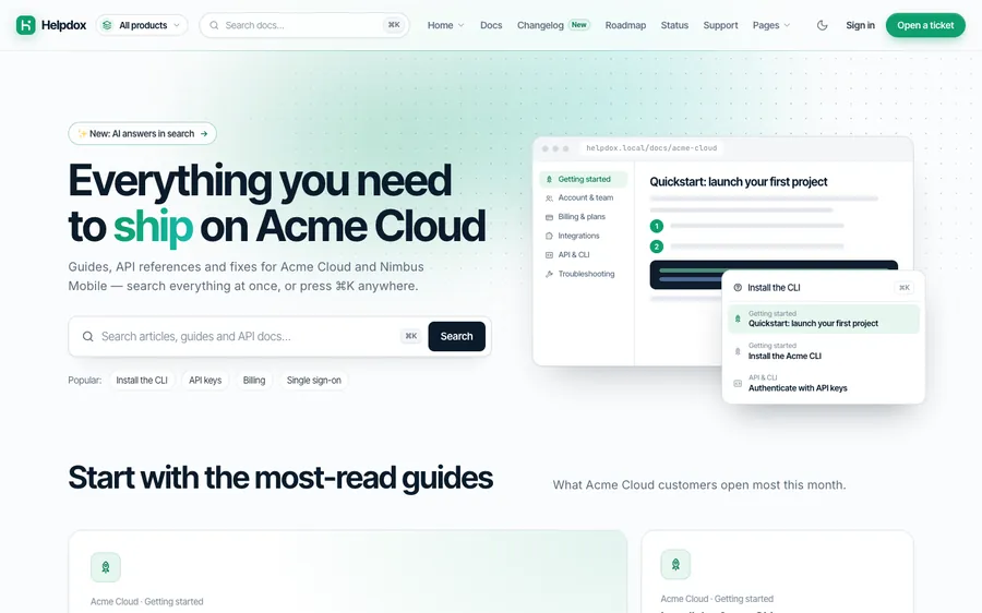
Go to Helpdox›Demo import. Import the whole demo website, pick one homepage, borrow a single page, or remove it all again.

03.1The six homepages
| Homepage | Made for | Preview |
|---|---|---|
| Theme & Plugin Vendor | Envato purchase codes, docs per item | Live demo |
| SaaS Help Center | Docs, tickets, status and changelog | Live demo |
| Developer API | API reference, SDKs and webhooks | Live demo |
| Mobile App | App help with store links | Live demo |
| Hardware & Devices | Manuals, firmware and warranty | Live demo |
| Internal Wiki & IT | Private docs for your team | Live demo |



03.2Full website
Imports 111 help articles in 12 products, 16 pages, 23 changelog entries, 15 roadmap ideas, status incidents, menus, Theme Options and Helpdox settings. Steps: checking requirements, creating products, versions and categories, importing pages, articles, changelog, roadmap and incidents, linking everything together, building menus, applying theme options and helpdox settings, setting the front page, rebuilding the search index.
- Choose the Front page after import.
- Click Import the full website and confirm.
- Keep the tab open until it says All done! It takes under a minute on most hosts.
The import runs in small steps and remembers where it is. If you close the tab or the connection drops, open the screen again and it continues by itself.
03.3Choose your front page
Click Import & set under any homepage. The page arrives with the docs of its own products (for example the three vendor products for the Theme & Plugin Vendor homepage), so no section is empty.
03.4Import a single page
Pick a page (pricing, features, about, contact, sign in, a homepage…) and click Import this page. A homepage brings its products’ docs along.
03.5Remove demo content
Remove demo content deletes only what the importer created and restores your earlier Theme Options, Helpdox settings, menus and front page. Pages and articles you wrote yourself are never touched, and demo items you edited after the import are left as they are on a second import.
Developers can run the same jobs from the command line: wp helpdox demo full saas, wp helpdox demo front vendor, wp helpdox demo single pricing, wp helpdox demo remove.
Content
04Docs: products, versions & articles
Articles live in Docs. Group them by product, version and category, and Helpdox builds the docs home, product pages, category pages, navigation and URLs for you.
| Item | Where | What it does |
|---|---|---|
| Products | Docs›Products | One docs space per product with its own icon, card illustration, tagline, color skin and product family. |
| Versions | Docs›Versions | Optional. Mark one version of a product as current; older versions get a notice and a version switcher. |
| Categories | Docs›Categories | Topics inside a product, with icon and order. Sub-categories are fine. |
| Articles | Docs›Add New | Written in the block editor with Helpdox blocks for steps, callouts, code tabs, videos, FAQs and more. |


04.1Addresses
| Page | Address |
|---|---|
| Docs home | /docs/ |
| Product | /docs/acme-cloud/ |
| Category | /docs/acme-cloud/getting-started/ |
| Article (current version) | /docs/acme-cloud/getting-started/install-the-cli/ |
| Article (older version) | /docs/acme-cloud/v1/getting-started/install-the-cli/ |
The same article slug can exist in several versions. Change the base (“docs”) in Helpdox›Settings›Docs.
04.2Article settings
| Setting | Choices |
|---|---|
| Who can read it | Everyone · Signed-in users · Chosen roles. Members-only articles are hidden from search, feeds and the REST API for everyone else; optionally shown with a lock in the navigation. |
| Layout | Docs (navigation + table of contents) · Focus (centered, no navigation column) · Wide (API reference with code beside the text). |
| Related articles | Pick articles by hand; otherwise Helpdox suggests articles from the same category. |
| Show “Updated … ago” | On or off per article. |
Order articles with Page Attributes›Order in the article sidebar. Lower numbers come first.
Find answers
05Instant search & ⌘K
Press ⌘ K (or Ctrl K) anywhere, or type in a search box. Results appear as you type, grouped by product, with deep links to the right heading.

- Typo tolerant: “pasword” still finds “password”.
- Inside a product, search covers that product and version only.
- Members-only articles never appear for visitors who may not read them.
- The search index rebuilds itself when you save an article. Developers can rebuild it with
wp helpdox index.
Searches without results are recorded (without personal data) in Helpdox›Insights, so you know which articles to write next.
Elementor + blocks
06The 33 elements
Search heroes, product cards, popular topics, steps, code tabs, API endpoints, ticket forms, pricing tables and more. The settings tables below come straight from the plugin.
Every element is built once and shows up in both builders. The settings and the output are the same in each, so a page made in Elementor and one made with blocks look identical.
| Builder | Where to find the elements |
|---|---|
| Elementor | Widget panel → category Helpdox (or search “Helpdox”). |
| Block editor | Block inserter (+) → category Helpdox (or type “/” and the name). |
Elements load their CSS and JavaScript only on pages that use them. On pages built only from containers and Helpdox elements, Elementor’s own front-end scripts are skipped too, which keeps mobile speed scores high.
06.1Account Form
Sign-in, sign-up or password reset card beside an illustration, using WordPress accounts.
helpdox/account-formWidget helpdox-account-form| Setting | Type | Choices and notes |
|---|---|---|
| Small title | Text | |
| Heading | Text | |
| Text under the heading | Text area | |
| Form | Choice | Sign in, Create account, Reset password |
| Link to the other form (sign in ↔ create account) | Link | |
| After signing in, go to | Link | |
| Illustration | Choice | 25 choices |
| Width | Choice | Contained (1240px), Narrow (860px), Wide (1440px) |
| Space above | Choice | Large, Medium, None |
| Heading alignment | Choice | Left, Center, Split (text on the right) |
| Background | Choice | None, Soft tint band, Deep ink band, Dot grid |
06.2Annotated Screenshot
A screenshot with numbered hotspots that explain each part of the screen.
helpdox/annotated-imageWidget helpdox-annotated-image| Setting | Type | Choices and notes |
|---|---|---|
| Screenshot | Image | Empty shows a sample dashboard drawing. |
| Image description | Text | |
| Hotspots | List | Each item: Left (%), Top (%), Label, Explanation |
| Caption | Text | |
| Numbered legend below | On / off |
06.3API Endpoint
Reference for one API endpoint: parameters, request examples and the response.
helpdox/api-endpointWidget helpdox-api-endpoint| Setting | Type | Choices and notes |
|---|---|---|
| Method | Choice | GET, POST, PUT, PATCH, DELETE |
| Path | Text | |
| Title | Text | |
| Description | Text with links | |
| Auth / scope note | Text | |
| Parameters | List | Each item: Name, Type, Required, Description |
| Request examples | List | Each item: Label, Language, Code |
| Response (JSON) | Code | |
| Response status | Text |
06.4Was This Helpful?
Yes / No feedback for an article, with reasons and helpful-rate stats.
helpdox/article-feedbackWidget helpdox-article-feedback| Setting | Type | Choices and notes |
|---|---|---|
| Question | Text | |
| Yes label | Text | |
| No label | Text | |
| Thank-you text | Text | |
| Ask why after “No” | On / off | |
| Show helpful rate | On / off | |
| Article | Pick a post |
06.5Callout
Highlight a note, tip, warning or important detail inside an article.
helpdox/calloutWidget helpdox-callout| Setting | Type | Choices and notes |
|---|---|---|
| Type | Choice | Note, Tip, Warning, Important, Success |
| Title | Text | Empty uses the type name. |
| Text | Text with links |
06.6Category Grid
Docs topics as cards with icons and article counts — optionally with their first articles.
helpdox/category-gridWidget helpdox-category-grid| Setting | Type | Choices and notes |
|---|---|---|
| Small title | Text | |
| Heading | Text | |
| Text under the heading | Text area | |
| Product | Choice | 13 choices |
| How many | Number | 2–24 |
| Columns | Choice | 2, 3, 4 |
| Style | Choice | Cards, Cards with first articles, Minimal rows |
| Width | Choice | Contained (1240px), Narrow (860px), Wide (1440px) |
| Space above | Choice | Large, Medium, None |
| Heading alignment | Choice | Left, Center, Split (text on the right) |
| Background | Choice | None, Soft tint band, Deep ink band, Dot grid |
06.7Code Tabs
Code samples in several languages with tabs and a copy button.
helpdox/code-tabsWidget helpdox-code-tabs| Setting | Type | Choices and notes |
|---|---|---|
| Title (file name or request) | Text | |
| Tabs | List | Each item: Tab label, Language, Code |
| Line numbers | On / off | |
| Max visible lines (0 = all) | Number | 0–200 |
06.8Contact Form
A spam-protected contact form beside your contact details. Messages arrive by email.
helpdox/contact-formWidget helpdox-contact-form| Setting | Type | Choices and notes |
|---|---|---|
| Small title | Text | |
| Heading | Text | |
| Text under the heading | Text area | |
| Topics (comma separated) | Text | |
| Button | Text | |
| Contact details | List | Each item: Icon, Label, Text, Link |
| Width | Choice | Contained (1240px), Narrow (860px), Wide (1440px) |
| Space above | Choice | Large, Medium, None |
| Heading alignment | Choice | Left, Center, Split (text on the right) |
| Background | Choice | None, Soft tint band, Deep ink band, Dot grid |
06.9Call to Action Band
A bold closing panel with heading, text, two buttons and an illustration.
helpdox/cta-bandWidget helpdox-cta-band| Setting | Type | Choices and notes |
|---|---|---|
| Small title | Text | |
| Heading | Text | |
| Text under the heading | Text area | |
| Button | Text | |
| Button link | Link | |
| Second button | Text | |
| Second button link | Link | |
| Small print | Text | |
| Button style | Choice | Buttons, App download buttons |
| Illustration | Choice | 25 choices |
| Panel | Choice | Accent gradient, Deep ink, Soft |
| Width | Choice | Contained (1240px), Narrow (860px), Wide (1440px) |
| Space above | Choice | Large, Medium, None |
| Heading alignment | Choice | Left, Center, Split (text on the right) |
| Background | Choice | None, Soft tint band, Deep ink band, Dot grid |
06.10Downloads
A tidy list of manuals, firmware, drivers or brand assets with file type, size and version.
helpdox/downloadsWidget helpdox-downloads| Setting | Type | Choices and notes |
|---|---|---|
| Small title | Text | |
| Heading | Text | |
| Text under the heading | Text area | |
| Files | List | Each item: Title, Details (type · size · version), Tag, File link |
| Columns | Choice | 1, 2 |
| Width | Choice | Contained (1240px), Narrow (860px), Wide (1440px) |
| Space above | Choice | Large, Medium, None |
| Heading alignment | Choice | Left, Center, Split (text on the right) |
| Background | Choice | None, Soft tint band, Deep ink band, Dot grid |
06.11FAQ Accordion
Questions and answers in an accessible accordion, with optional Google FAQ markup.
helpdox/faqWidget helpdox-faq| Setting | Type | Choices and notes |
|---|---|---|
| Questions | List | Each item: Question, Answer |
| Open at start | Choice | First question, None, All |
| Style | Choice | Lines, Cards |
| Add FAQ structured data (SEO) | On / off |
06.12Feature Grid
Icon, title and text items — features, quick links or how it works — in 2 to 4 columns.
helpdox/feature-gridWidget helpdox-feature-grid| Setting | Type | Choices and notes |
|---|---|---|
| Small title | Text | |
| Heading | Text | |
| Text under the heading | Text area | |
| Items | List | Each item: Icon, Title, Text, Link (optional) |
| Columns | Choice | 2, 3, 4 |
| Style | Choice | Cards, Plain, Icon beside text |
| Width | Choice | Contained (1240px), Narrow (860px), Wide (1440px) |
| Space above | Choice | Large, Medium, None |
| Heading alignment | Choice | Left, Center, Split (text on the right) |
| Background | Choice | None, Soft tint band, Deep ink band, Dot grid |
06.13Glossary
Terms and definitions, sorted A–Z, with a jump bar and a filter box.
helpdox/glossaryWidget helpdox-glossary| Setting | Type | Choices and notes |
|---|---|---|
| Terms | List | Each item: Term, Definition |
| Filter box | On / off | |
| A–Z jump bar | On / off |
06.14Help Cards
“Still need help?” — ways to reach your team, beside an illustration or as a row of cards.
helpdox/help-cardsWidget helpdox-help-cards| Setting | Type | Choices and notes |
|---|---|---|
| Small title | Text | |
| Heading | Text | |
| Text under the heading | Text area | |
| Cards | List | Each item: Icon, Title, Text, Link, Highlight |
| Illustration | Choice | 25 choices |
| Layout | Choice | Panel: text + illustration | cards, Row of cards |
| Width | Choice | Contained (1240px), Narrow (860px), Wide (1440px) |
| Space above | Choice | Large, Medium, None |
| Heading alignment | Choice | Left, Center, Split (text on the right) |
| Background | Choice | None, Soft tint band, Deep ink band, Dot grid |
06.15Illustration
An illustration from the Helpdox library that follows your colors and dark mode.
helpdox/illustrationWidget helpdox-illustration| Setting | Type | Choices and notes |
|---|---|---|
| Illustration | Choice | 24 choices |
| Description for screen readers | Text | Empty = decorative (hidden from screen readers). |
| Caption | Text | |
| Max width (px) | Number | 80–1200 |
| Alignment | Choice | Center, Left, Right |
| Below the fold (render lazily) | On / off | |
| Accent color | Color |
06.16Popular Articles
The guides customers open most (or the newest), as a bento grid, cards or a compact list.
helpdox/popular-articlesWidget helpdox-popular-articles| Setting | Type | Choices and notes |
|---|---|---|
| Small title | Text | |
| Heading | Text | |
| Text under the heading | Text area | |
| Product | Choice | 13 choices |
| Show | Choice | Most read, Recently updated |
| How many | Number | 2–12 |
| Layout | Choice | Bento (first one big), Cards, Compact list (2 columns) |
| Product illustration in the big card | On / off | |
| Width | Choice | Contained (1240px), Narrow (860px), Wide (1440px) |
| Space above | Choice | Large, Medium, None |
| Heading alignment | Choice | Left, Center, Split (text on the right) |
| Background | Choice | None, Soft tint band, Deep ink band, Dot grid |
06.17Pricing Table
Plans with a monthly/yearly switch, a highlighted plan and what each one includes.
helpdox/pricing-tableWidget helpdox-pricing-table| Setting | Type | Choices and notes |
|---|---|---|
| Small title | Text | |
| Heading | Text | |
| Text under the heading | Text area | |
| Plans | List | Each item: Name, Short description, Monthly price, Yearly price (per month), Price unit, Features (one per line), Button, Button link, Badge (featured plan) |
| Monthly / yearly switch | On / off | |
| Yearly saving label | Text | |
| Small print below | Text | |
| Width | Choice | Contained (1240px), Narrow (860px), Wide (1440px) |
| Space above | Choice | Large, Medium, None |
| Heading alignment | Choice | Left, Center, Split (text on the right) |
| Background | Choice | None, Soft tint band, Deep ink band, Dot grid |
06.18Product Cards
Your products’ docs spaces as big illustrated cards, compact tiles or a list.
helpdox/product-cardsWidget helpdox-product-cards| Setting | Type | Choices and notes |
|---|---|---|
| Small title | Text | |
| Heading | Text | |
| Text under the heading | Text area | |
| Products (slugs, comma separated) | Text | Empty shows every product in its menu order. |
| Layout | Choice | Big cards (2 per row), Tiles (3 per row), List |
| Link label | Text | |
| Width | Choice | Contained (1240px), Narrow (860px), Wide (1440px) |
| Space above | Choice | Large, Medium, None |
| Heading alignment | Choice | Left, Center, Split (text on the right) |
| Background | Choice | None, Soft tint band, Deep ink band, Dot grid |
06.19Related Articles
Links to related docs: hand-picked, same category or most popular.
helpdox/related-articlesWidget helpdox-related-articles| Setting | Type | Choices and notes |
|---|---|---|
| Title | Text | |
| Articles | Choice | Related (set on the article), then same category, Same category, Most popular |
| Product (popular) | Choice | 13 choices |
| How many | Number | 1–12 |
| Layout | Choice | List, Cards |
06.20Roadmap
Public roadmap: ideas by stage, voting and feature suggestions.
helpdox/roadmapWidget helpdox-roadmap| Setting | Type | Choices and notes |
|---|---|---|
| Product | Choice | 13 choices |
| Product filter chips | On / off | |
| Show the Shipped column | On / off | |
| “Suggest a feature” form | On / off | |
| Ideas per column | Number | 1–50 |
06.21Search Hero
A large help-center search box with instant results, popular searches and an optional product scope.
helpdox/search-heroWidget helpdox-search-hero| Setting | Type | Choices and notes |
|---|---|---|
| Small title | Text | |
| Announcement pill | Text | For example “✨ New: AI answers”. Replaces the small title when set. |
| Announcement link | Link | |
| Heading | Text | |
| Accent words in the heading | Text | Part of the heading shown in the accent gradient, e.g. “help”. |
| Text | Text area | |
| Search placeholder | Text | |
| Search in | Choice | 13 choices Limit results to one product’s current docs. |
| Popular searches | Text | Comma separated. Empty hides the line. |
| Show the ⌘K shortcut hint | On / off | |
| Illustration | Choice | 25 choices Shown beside the search on wide screens. |
| Visual | Choice | Illustration (choose below), Docs preview with ⌘K results, Code card, Phone with in-app help, Product pictures + “Find your model”, Product tiles under the search, Quick-action tiles under the search Docs preview, phone, tiles and pictures use your real products and articles. |
| Products for the visual (slugs, comma separated) | Text | |
| Code card title | Text | |
| Code language | Choice | Shell, JavaScript, Python, PHP, JSON |
| Code | Code | |
| Floating notes on the phone (comma separated) | Text | |
| Quick actions | List | Each item: Icon, Title, Text, Link |
| Heading level | Choice | H1, H2 |
| Alignment | Choice | Center, Left |
| Size | Choice | Large, Compact |
| Background | Choice | Dot grid with glow, Line grid with glow, Plain panel, Deep ink (dark), Warm band, None |
| Accent color | Color |
06.22Section Heading
Small title, big heading, text and up to two buttons — on the same rhythm as every Helpdox section.
helpdox/section-headingWidget helpdox-section-heading| Setting | Type | Choices and notes |
|---|---|---|
| Small title | Text | |
| Heading | Text | |
| Text under the heading | Text area | |
| Button | Text | |
| Button link | Link | |
| Second button | Text | |
| Second button link | Link | |
| Page title size (H1) | On / off | |
| Width | Choice | Contained (1240px), Narrow (860px), Wide (1440px) |
| Space above | Choice | Large, Medium, None |
| Heading alignment | Choice | Left, Center, Split (text on the right) |
| Background | Choice | None, Soft tint band, Deep ink band, Dot grid |
06.23Stats Strip
A row of big numbers with short labels, in a panel or on its own.
helpdox/stats-stripWidget helpdox-stats-strip| Setting | Type | Choices and notes |
|---|---|---|
| Small title | Text | |
| Heading | Text | |
| Text under the heading | Text area | |
| Numbers | List | Each item: Number, Label |
| Style | Choice | Panel, Plain with dividers |
| Width | Choice | Contained (1240px), Narrow (860px), Wide (1440px) |
| Space above | Choice | Large, Medium, None |
| Heading alignment | Choice | Left, Center, Split (text on the right) |
| Background | Choice | None, Soft tint band, Deep ink band, Dot grid |
06.24Status Page
System status with 90-day uptime bars and incident history.
helpdox/status-pageWidget helpdox-status-page| Setting | Type | Choices and notes |
|---|---|---|
| Layout | Choice | Full status page, Compact card |
| Days of uptime bars | Number | 30–90 |
| Incident history (days) | Number | 0–90 |
06.25Steps
Numbered how-to steps with text and optional code.
helpdox/stepsWidget helpdox-steps| Setting | Type | Choices and notes |
|---|---|---|
| Steps | List | Each item: Title, Text, Code (optional) |
| Step title level | Choice | H3, H4, Paragraph |
06.26Team Grid
Team members with role, location and an avatar (photo or colored initials).
helpdox/team-gridWidget helpdox-team-grid| Setting | Type | Choices and notes |
|---|---|---|
| Small title | Text | |
| Heading | Text | |
| Text under the heading | Text area | |
| People | List | Each item: Name, Role, Location, Photo (optional), Avatar color |
| Width | Choice | Contained (1240px), Narrow (860px), Wide (1440px) |
| Space above | Choice | Large, Medium, None |
| Heading alignment | Choice | Left, Center, Split (text on the right) |
| Background | Choice | None, Soft tint band, Deep ink band, Dot grid |
06.27Testimonials
Customer quotes with name, role and an initials avatar — grid or one big quote.
helpdox/testimonialsWidget helpdox-testimonials| Setting | Type | Choices and notes |
|---|---|---|
| Small title | Text | |
| Heading | Text | |
| Text under the heading | Text area | |
| Quotes | List | Each item: Quote, Name, Role, company, Avatar color |
| Layout | Choice | Grid, One big quote |
| Five-star row | On / off | |
| Width | Choice | Contained (1240px), Narrow (860px), Wide (1440px) |
| Space above | Choice | Large, Medium, None |
| Heading alignment | Choice | Left, Center, Split (text on the right) |
| Background | Choice | None, Soft tint band, Deep ink band, Dot grid |
06.28Ticket Form
Support request form that suggests articles while customers type and verifies purchases.
helpdox/ticket-formWidget helpdox-ticket-form| Setting | Type | Choices and notes |
|---|---|---|
| Title | Text | |
| Intro | Text area | |
| Ask which product | On / off | |
| Let customers choose a priority | On / off | |
| Ask for a website address | On / off | |
| Button | Text | |
| Layout | Choice | Form + suggestions side by side, Stacked |
06.29Ticket Portal
Customers see their tickets, read replies, answer and attach files.
helpdox/ticket-portalWidget helpdox-ticket-portal| Setting | Type | Choices and notes |
|---|---|---|
| Title | Text |
06.30Updates & Status
Latest changelog entries next to a live system status card with uptime bars.
helpdox/updates-statusWidget helpdox-updates-status| Setting | Type | Choices and notes |
|---|---|---|
| Small title | Text | |
| Heading | Text | |
| Text under the heading | Text area | |
| Product updates | Choice | 13 choices |
| Updates | Number | 1–8 |
| Status card | On / off | |
| Uptime days | Number | 7–90 |
| Status page link | Link | |
| Width | Choice | Contained (1240px), Narrow (860px), Wide (1440px) |
| Space above | Choice | Large, Medium, None |
| Heading alignment | Choice | Left, Center, Split (text on the right) |
| Background | Choice | None, Soft tint band, Deep ink band, Dot grid |
06.31Video Tutorial
A fast click-to-play video (YouTube, Vimeo or a file) with title and length.
helpdox/videoWidget helpdox-video| Setting | Type | Choices and notes |
|---|---|---|
| Video URL | Link | YouTube, Vimeo or an .mp4/.webm file. |
| Title | Text | |
| Length | Text | |
| Cover image | Image | Empty shows a branded cover (no request to the video site). |
| Shape | Choice | 16:9, 4:3, 1:1 |
06.32Warranty Check
Purchase date in, coverage out: a friendly warranty lookup with a link to start a claim.
helpdox/warranty-checkWidget helpdox-warranty-check| Setting | Type | Choices and notes |
|---|---|---|
| Small title | Text | |
| Heading | Text | |
| Text under the heading | Text area | |
| Warranty length (months) | Number | 1–120 |
| Claim button | Text | |
| Claim link | Link | |
| Small print | Text | |
| Width | Choice | Contained (1240px), Narrow (860px), Wide (1440px) |
| Space above | Choice | Large, Medium, None |
| Heading alignment | Choice | Left, Center, Split (text on the right) |
| Background | Choice | None, Soft tint band, Deep ink band, Dot grid |
06.33What’s New
Latest changelog entries with tags and dates.
helpdox/whats-newWidget helpdox-whats-new| Setting | Type | Choices and notes |
|---|---|---|
| Title | Text | |
| How many | Number | 1–10 |
| Product | Choice | 13 choices |
| Layout | Choice | Timeline, Cards |
| Show summaries | On / off |
Support
07Tickets & the support portal
Customers open tickets from the Ticket Form element and follow them in the Ticket Portal element. Your team answers in Helpdox›Tickets.


07.1Set it up
- Create two pages: one with the Ticket Portal element (for example /support/) and one with the Ticket Form element (/support/new/). The demo import creates both.
- Choose them in Helpdox›Settings›Tickets, together with the email address for new-ticket alerts, topics, reply time and SLA targets per priority.
- Give support staff the Support Agent role (or any role with the
hdx_manage_ticketscapability).
07.2Customer accounts
- Customers don’t need an account to open a ticket — guests get a private link by email.
- If you allow sign-ups (Settings›General›Anyone can register), people who register with the Account Form element get the Customer role. Signed-in customers see all their tickets in the portal.
- Customers never see the WordPress dashboard: no admin bar, and opening
/wp-admin/sends them to the support portal. After signing in they land on the portal too. Forgotten passwords use the normal reset link on the sign-in form. - Anyone who can edit posts or manage tickets (administrators, editors, Support Agents) keeps full dashboard access. Developers can turn the rule off with the
helpdox_customer_frontend_onlyfilter.
07.3What customers get
- Suggested articles while they type the subject — and a “Yes, I don’t need a ticket” button that counts as an avoided ticket.
- A drag-and-drop attachment area with previews, type and size checks and an upload progress bar.
- A private link to the ticket by email, so guests never need an account. Signed-in customers see all their tickets.
- Replies by email, with the full thread on the ticket page.
07.4Purchase verification
| Method | How it works |
|---|---|
| Envato | Customers enter their purchase code. Helpdox checks it with your personal Envato token (saved encrypted, never shown again) and shows “Supported until …” or “Support expired” on the ticket. |
| WooCommerce | Customers enter an order number; it must match their billing email. Support lasts the number of months you set. |
| License keys | Paste keys (key | email | end date) in settings; useful for software sold elsewhere. |
- Create a personal token at build.envato.com → Create a token with the permission “View your items’ sales history”.
- Paste it in Helpdox›Settings›Purchases → Envato personal token and save. The field is encrypted and stays empty afterwards.
- Check Envato connection under the token field: “✓ Connected” means Envato accepts your token and codes are checked live.
- Optional: limit codes to some of your items with Envato item IDs (comma separated), turn on Only verified customers can open tickets, and Refuse tickets when support has expired (the customer is asked to renew support first).
Results are cached for 12 hours. If Envato is down or your token is wrong, the ticket is accepted and marked “Not checked” — a customer is never refused because of a token problem. If many tickets show “Not checked”, create a new token.
07.5Answering tickets
Helpdox›Tickets opens the queue: counts for open, waiting, answered and avoided tickets, status tabs, Assigned to me and search. Each row shows the priority, the verification badge and an SLA badge (on time, due soon or overdue).
- Reply — the customer gets an email with a link back to the ticket. Pick a saved reply to fill the box, then edit it.
- Internal note — tick “Internal note” to leave a message only your team sees.
- Status, priority and assignee — change them in the side panel; the assignee is the agent responsible for the next answer.
- Customer card — purchase status (re-check with one click) and the customer’s other tickets.
- Attachments — open files from the thread; they are never public URLs.
07.6Statuses
| Status | Meaning |
|---|---|
| Open | New ticket, nobody has answered yet. The SLA clock is running. |
| Waiting on us | The customer replied — your team owes the next answer. |
| Answered | Your team replied and is waiting for the customer. |
| On hold | Parked on purpose (waiting for a release, a third party…). Not auto-closed. |
| Closed | Solved. The customer can reopen it by replying. |
Statuses change by themselves: a staff reply sets Answered, a customer reply sets Waiting on us. Answered tickets without a customer reply are closed after the number of days in Close answered tickets after (7 by default, 0 turns it off), and the customer gets an email saying so.
07.7Settings reference
| Setting | What it does |
|---|---|
| Support portal page / New ticket page | The pages with the Ticket Portal and Ticket Form elements. Links in emails point here. |
| Notify staff at | Email for new tickets and customer replies. Use a shared inbox or a comma-separated list. |
| Sender name | The “From” name on ticket emails. |
| Topics | The topic dropdown on the form, one per line. |
| Promised reply time | Shown on the form and in the confirmation email (for example “within one business day”). |
| First response targets | Hours per priority (Low 48, Normal 24, High 8, Urgent 2 by default). Drives the SLA badges. |
| Attachments per message / Max file size | Upload limits (3 files, 8 MB by default). Images, PDF, text, logs and zip files are allowed. |
| Suggest articles while customers type | Turns the answer suggestions on the ticket form on or off. |
| Saved replies | Blocks separated by a line with ---; the first line of each block is its name. |
07.8Emails
| Who | When |
|---|---|
| Customer | Ticket received (with the private link), a new staff reply, ticket closed automatically, “email me my tickets” links. |
| Staff | New ticket, new customer reply. |
Emails are sent from your site with the sender name above. If they do not arrive, see the FAQ about SMTP below.
07.9Privacy
Tickets, replies and attachments are included in WordPress’s Tools → Export Personal Data and Erase Personal Data, so you can answer GDPR requests from the usual screens.
07.10For developers
| Hook | Use |
|---|---|
helpdox_ticket_created (action: $ticket_id) | Send a ticket to Slack, a CRM or a webhook. |
helpdox_reply_added (action: $reply_id, $ticket_id, $by, $is_note) | React to customer or staff replies. |
helpdox_ticket_status (action: $ticket_id, $new, $old) | Run code when a ticket is closed or reopened. |
helpdox_verify_purchase (filter: null, $code, $email, $method) | Return your own result to verify purchases from another store or license server. |
Attachments are stored in a private folder with a random name and served only to the customer and staff. Forms use nonces, a honeypot and per-IP rate limits.
Keep customers informed
08Changelog, roadmap & status
Three places your customers check before they write to you.
08.1Changelog
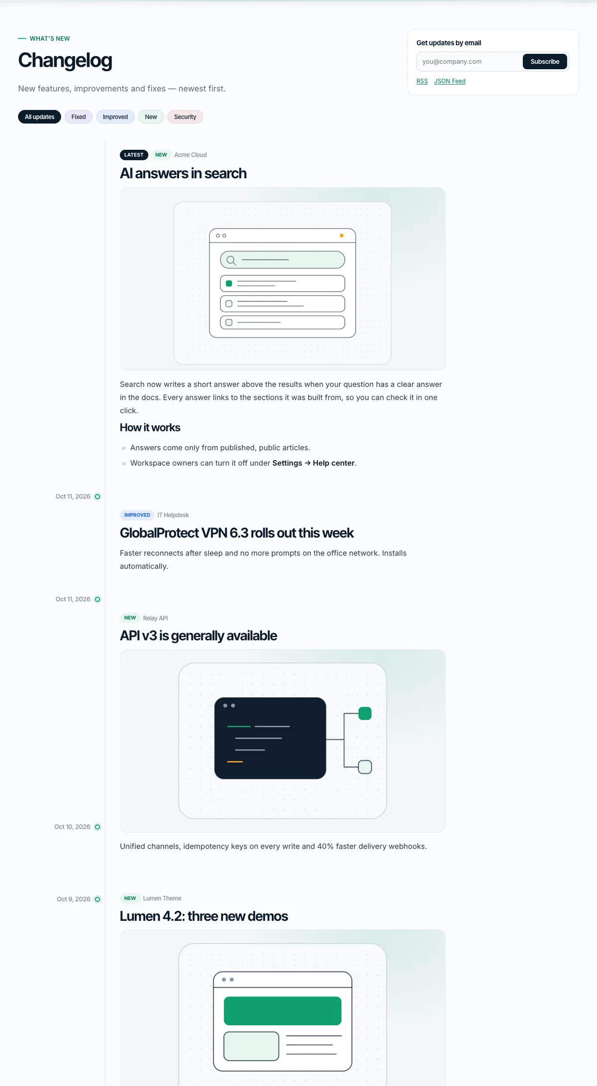
Add entries in Helpdox›Changelog with tags (New, Improved, Fixed, Security) and a product. They appear at /changelog/, in RSS and a JSON feed (/changelog/feed.json), in the What’s New element, and readers can subscribe by email (double opt-in). The menu item gets a “New” badge for a few days after each entry.
08.2Roadmap
Ideas in Helpdox›Roadmap move through Under review → Planned → In progress → Shipped. Visitors vote once per idea and can suggest new ones (held for review). Show the board with the Roadmap element.

08.3Status page
List your components in Helpdox›Settings›Status (one per line: Name | Group | Description). Report incidents in Helpdox›Status incidents with impact and a timeline of updates. The Status Page element shows live status and 90-day uptime bars computed from your incidents; the footer shows a status dot.

Measure
09Insights & AI-ready docs
Helpdox›Insights shows searches, failed searches, low-rated articles, tickets avoided and top topics — with an optional weekly email.

09.1AI-ready
/llms.txtand/llms-full.txtlist your public docs for AI assistants (members-only articles are never included).- Every article has Copy as Markdown, and
?format=mdreturns its Markdown. - Ask AI (off by default): with your own Anthropic API key in Helpdox›Settings›AI, the search palette can answer questions using only your public articles, with links to the sources. The key is saved encrypted and never shown again.
When Ask AI is on, the visitor’s question and matching public article excerpts are sent to Anthropic’s API to write the answer. Mention this in your privacy policy.
Switching
10Import docs from another plugin
Coming from another knowledge base? Helpdox›Import moves your docs in a few clicks. Your original content stays untouched.

| Source | What comes over |
|---|---|
| BetterDocs | Knowledge bases become products; categories keep their hierarchy; articles keep content, order, dates and view counts. |
| Echo Knowledge Base, Heroic KB | Categories and articles. |
| weDocs, EazyDocs | Each top-level doc becomes a product, its sections become categories, everything below becomes articles. |
| CSV file | Columns: title, content, excerpt, category, parent_category, product, version, order, slug, status. Only title is required. |
- Leave Dry run ticked and click Run import to see what would be imported.
- Untick it and run it again. Running it a third time only adds what is new.
- Old article addresses redirect (301) to the new docs addresses.
The source plugin can be deactivated already — Helpdox reads its data directly. From the command line: wp helpdox import detect, then wp helpdox import betterdocs --dry-run.
Settings
11Theme Options
One screen with 6 tabs: colors and skins, layout, header, docs, footer, and dark mode with motion. You don’t need the Customizer.
Go to Appearance›Theme Options. Changes apply to the whole site after Save changes; Reset to defaults restores the original values.

11.1Colors
| Section | Option | What it does |
|---|---|---|
| Skin | Color skin | A ready palette for light and Midnight mode. Pages and products can pick their own; the colors below override it. |
| Brand | Accent | Buttons, focus rings, active states and illustrations. |
| Brand | Links | A darker shade of the accent keeps links readable (4.5:1 contrast). |
| Brand | Second accent | Used in gradients of illustrations and code highlights. |
11.2Layout
| Section | Option | What it does |
|---|---|---|
| Page | Maximum width | The docs layout and header never get wider than this. |
| Page | Corner roundness |
11.3Header
| Section | Option | What it does |
|---|---|---|
| Header | Style | Pages can choose another style in their “Page design” box. |
| Header | Sticky header | |
| Header | Search button (⌘K) | Opens the instant search palette. |
| Header | “Sign in” link | Hidden for signed-in visitors. |
| Header | Button label | Empty hides the button. |
| Header | Button link | Empty links to /contact/. Also used by “Contact support” in search. |
| Header | Demo switcher (“Home” menu with thumbnails) | For live previews of several demo homepages. Leave off on a real site. |
11.4Docs
| Section | Option | What it does |
|---|---|---|
| Article page | Table of contents | Built from H2/H3 headings; sticky on wide screens, a dropdown on smaller ones. |
| Article page | “Updated … ago” | Each article can hide it in its Article settings box. |
| Article page | Reading time | |
| Article page | “Was this helpful?” | |
| Article page | Previous / next article | |
| Navigation | Article counts in the sidebar |
11.5Footer
| Section | Option | What it does |
|---|---|---|
| Footer | Style | |
| Footer | Short text under the logo | |
| Footer | Copyright line | Empty shows “© year Site name”. {year} is replaced by the current year. |
11.6Dark mode & motion
| Section | Option | What it does |
|---|---|---|
| Midnight dark mode | Light/dark button in the header | Visitors can switch; their choice is remembered. |
| Midnight dark mode | Default scheme | |
| Motion | Soft motion | Gently floating illustrations and fades. Never shown to visitors who prefer reduced motion. |
Look & feel
12Skins, headers, footers & dark mode
Pick a color skin, a header style and a footer style for the whole site — then let single pages and products choose their own.
12.1Color skins
| Skin | Key |
|---|---|
| Emerald (default) | emerald |
| Violet | violet |
| Ocean blue | ocean |
| Rose | rose |
| Ember orange | ember |
| Terminal cyan | cyan |
Each skin has matching values for light mode and Midnight (dark) mode. Your own colors in Theme Options›Colors always win.
12.2Header and footer styles
| Header styles | Footer styles |
|---|---|
| Glass (default), Solid, Deep ink, Minimal (no search pill) | Columns (default), Help banner + columns, Minimal (one row) |
The header is 74 px tall and glides to 60 px once you scroll; on phones it stays 60 px. Dropdowns open on hover with a mouse, on tap with touch, and with Enter, Space or ↓ from the keyboard.
12.3Per page and per product
| Where | How |
|---|---|
| A page | Edit the page → Page design box: color skin, header, footer and product family. |
| A product’s docs | Docs›Products → edit → Color skin. All its docs pages follow. |
| Product family | Give products the same family name (for example “vendor”); on their pages the header product switcher lists only that family. |
12.4Midnight dark mode
Visitors switch with the moon button; their choice is remembered and there is no flash on page load. Set the default (light, dark or follow the device) in Theme Options›Dark mode & motion.

Navigation
13Menus & the demo switcher
Create menus in Appearance›Menus and assign them to these locations.
| Location | Name |
|---|---|
primary | Header menu |
footer | Footer links |
- Second-level items open in a dropdown panel; add a Description to an item to show a small line under it.
- Give a menu item the CSS class
hdx-newfor a “New” badge. The Changelog link gets one automatically after new entries. - The Home demo switcher with thumbnails (Theme Options›Header›Demo switcher) is meant for live previews; leave it off on a real site.

Quality
14Speed, accessibility, RTL & translation
Helpdox is built to score high on PageSpeed: every demo homepage scores 95+ on mobile in our tests.
- Fonts are bundled and self-hosted (no Google requests); the two first-screen fonts are preloaded.
- Small stylesheets and scripts are printed inline, and elements load their code only where they are used.
- No jQuery on Helpdox pages; Elementor’s front-end scripts are skipped on pages made only of Helpdox elements.
- Every illustration is an inline SVG — no image requests for the art.
14.1Accessibility
- Skip link, visible focus rings, landmarks and labelled controls.
- Search palette, dropdowns, drawers and accordions work with the keyboard and screen readers.
- All motion is soft and stops for visitors who prefer reduced motion.
14.2Right-to-left
Every stylesheet has a mirrored -rtl.css copy that loads automatically for Arabic, Hebrew, Persian and other RTL site languages.
14.3Translate
- Install the free Loco Translate plugin (or use Poedit).
- Create a translation from
helpdox/languages/helpdox.potand fromhelpdox-core/languages/helpdox-core.pot. - Set your site language in Settings›General›Site Language.
14.4Caching
Use a page cache (your host’s, WP Super Cache, LiteSpeed Cache or WP Rocket). Search and ticket pages are cache-friendly: search runs through the REST API and ticket pages send no-cache headers themselves.
Developers
15Child theme, hooks & WP-CLI
Put custom code in Helpdox Child so updates never erase it. Every action and filter below is read from the code.
- Install
helpdox-child.zipfrom Appearance›Themes›Add New Theme›Upload Theme. Keep Helpdox installed. - Activate Helpdox Child. Menus and Theme Options are stored per theme, so set them again (or re-run the demo import).
- Add CSS to the child
style.cssand PHP to itsfunctions.php. To change a template, copy it fromhelpdox/into the same place inhelpdox-child/(for exampledocs/article.php).
/* helpdox-child/functions.php: add a violet product skin and a section to the help-center home */
add_filter( 'helpdox_home_sections', function ( $sections ) {
	$sections[] = [ 'cta-band', [ 'title' => 'Still deciding?', 'btn1' => 'See pricing', 'btn1_url' => '/pricing/' ] ];
	return $sections;
} );15.1Hooks
| Hook | Type | File | Use it to |
|---|---|---|---|
helpdox_ai_answer | Filter | helpdox-core/includes/class-ai.php | Answer Ask AI questions yourself: return an answer to skip the API call (question, context, sources). |
helpdox_ai_fallbacks | Filter | helpdox-core/includes/class-ai.php | Return false to stop asking the API for a fallback model when the chosen one is busy. |
helpdox_can_view | Filter | helpdox-core/includes/class-access.php | Decide whether the current visitor may read an article (article, visibility). |
helpdox_contact_to | Filter | helpdox-core/includes/class-forms.php | Send Contact Form messages to another address than the site admin email. |
helpdox_core_asset_documents | Filter | helpdox-core/includes/class-asset-loader.php | Add posts (such as builder templates) whose elements need their CSS/JS. |
helpdox_core_demo_dir | Filter | helpdox-core/includes/class-demo-import.php | Use another folder of demo data for the demo importer. |
helpdox_core_elementor_defaults | Filter | helpdox-core/includes/builders/class-elementor.php | Change the Elementor settings Helpdox Core applies once on activation. |
helpdox_core_enqueue_all | Action | helpdox-core/includes/class-asset-loader.php | Runs when every element asset is loaded (builder previews). |
helpdox_core_features | Filter | helpdox-core/includes/class-registry.php | Add or remove elements before they are registered in both builders. |
helpdox_core_fields_{slug} | Filter | helpdox-core/includes/class-feature.php | Change the settings of one element (slug such as search-hero). |
helpdox_core_icons | Filter | helpdox-core/includes/class-icons.php | Add or replace the duotone category icons. |
helpdox_core_illustrations | Filter | helpdox-core/includes/class-illustrations.php | Add your own SVG illustrations to the illustration picker. |
helpdox_core_import_budget | Filter | helpdox-core/includes/class-demo-import.php | Seconds of work per demo import step (default 4). |
helpdox_core_inline_css | Filter | helpdox-core/includes/class-asset-loader.php | Return false to load element CSS/JS as files instead of inline. |
helpdox_core_lean_elementor | Filter | helpdox-core/includes/class-asset-loader.php | Return false to keep Elementor’s front-end scripts on pages made only of Helpdox elements. |
helpdox_core_load_all_assets | Filter | helpdox-core/includes/class-asset-loader.php | Return true to load every element’s CSS and JS on every page. |
helpdox_core_page_features | Filter | helpdox-core/includes/class-asset-loader.php | Load the CSS/JS of elements a template prints itself, early in the head. |
helpdox_core_palette | Filter | helpdox-core/includes/class-palette.php | Change the ⌘K search palette settings (texts, groups, Ask AI row). |
helpdox_core_render_{slug} | Filter | helpdox-core/includes/class-feature.php | Filter the HTML of one element. |
helpdox_core_settings_saved | Action | helpdox-core/includes/class-settings.php | Runs after Helpdox → Settings is saved (all values). |
helpdox_core_settings_schema | Filter | helpdox-core/includes/class-settings.php | Add, change or remove Helpdox → Settings tabs and fields. |
helpdox_core_source | Filter | helpdox/inc/plugins.php | Point the plugin installer (TGMPA) at another Helpdox Core zip. |
helpdox_customer_frontend_only | Filter | helpdox-core/includes/class-customers.php | |
helpdox_defaults | Filter | helpdox/inc/options.php | Change the default value of any Theme Option. |
helpdox_demo_list | Filter | helpdox/inc/design.php | Change the demo homepages listed in the “Home” demo switcher. |
helpdox_demos | Filter | helpdox-core/includes/class-demos.php | Change the demo registry (titles, skins, header and footer styles, families). |
helpdox_docs_base | Filter | helpdox-core/includes/class-docs.php | Change the docs URL base (default “docs”, also in Helpdox → Settings). |
helpdox_docs_home_hero | Filter | helpdox/docs/home.php | Change the search hero of the help-center home (title, text, illustration). |
helpdox_docs_template | Filter | helpdox-core/includes/class-routes.php | Use another template file for a docs screen (home, product, category, article). |
helpdox_feedback | Action | helpdox-core/includes/class-feedback.php | Runs when a reader rates an article (article ID, helpful yes/no, reason, comment). |
helpdox_feedback_reasons | Filter | helpdox-core/includes/class-feedback.php | Change the reasons offered after a “No” vote. |
helpdox_front_is_help_center | Filter | helpdox/front-page.php | Return false to stop showing the help-center home on an empty front page. |
helpdox_home_faq | Filter | helpdox/docs/home.php | Change the questions of the help-center home FAQ. |
helpdox_home_help_cards | Filter | helpdox/inc/docs.php | Change the “Still need help?” cards of the help-center home. |
helpdox_home_sections | Filter | helpdox/docs/home.php | Add, remove or reorder the sections of the help-center home. |
helpdox_inline_css | Filter | helpdox/inc/assets.php | Return false to load the theme CSS as files instead of inline. |
helpdox_nav_open_all_below | Filter | helpdox/inc/docs.php | Up to this many articles (default 40) the docs navigation shows every category open. |
helpdox_nav_products | Filter | helpdox/inc/design.php | Change the products listed in the header product switcher. |
helpdox_options_schema | Filter | helpdox/inc/theme-options.php | Add, change or remove Theme Options tabs and fields. |
helpdox_reply_added | Action | helpdox-core/includes/class-tickets.php | Runs after a reply is added (reply ID, ticket ID, by customer or staff, internal note yes/no). |
helpdox_roadmap_stages | Filter | helpdox-core/includes/class-roadmap.php | Rename or add roadmap stages. |
helpdox_rtl_preview | Filter | helpdox/inc/assets.php | Return true to allow the ?hdxrtl=1 right-to-left preview link (for live demos). |
helpdox_search_groups | Filter | helpdox-core/includes/class-search.php | Change the grouped search results (groups, query words, arguments). |
helpdox_show_locked_in_nav | Filter | helpdox-core/includes/class-access.php | Show members-only articles with a lock in the navigation (true) or hide them. |
helpdox_skin_choices | Filter | helpdox-core/includes/class-term-meta.php | Change the color skins offered in Theme Options, pages and products. |
helpdox_skins | Filter | helpdox/inc/design.php | Add a color skin: accent, second accent, link and soft tint for light and Midnight mode. |
helpdox_status | Filter | helpdox/inc/template-tags.php | Change the status pill in the footer (state, label, link). |
helpdox_support_url | Filter | helpdox/search.php | Change the “Contact support” link used by search and the theme. |
helpdox_ticket_created | Action | helpdox-core/includes/class-tickets.php | Runs after a new ticket is created (ticket ID). |
helpdox_ticket_status | Action | helpdox-core/includes/class-tickets.php | Runs when a ticket changes status (ticket ID, new status, old status). |
helpdox_verify_purchase | Filter | helpdox-core/includes/class-verify.php | Verify purchases with your own system (code, email, method): return a result to skip the built-in checks. |
15.2WP-CLI
| Command | What it does |
|---|---|
wp helpdox demo full|front|single|remove [slug] | The demo importer jobs. |
wp helpdox import detect|<source> [--file=] [--product=] [--dry-run] | Import docs from BetterDocs, Echo KB, Heroic KB, weDocs, EazyDocs or CSV. |
wp helpdox index | Rebuild the search index. |
wp helpdox search "query" | Run a search from the terminal (debugging). |
wp helpdox misses | List searches without results. |
wp helpdox features | List the elements with their block and widget names. |
Answers
16FAQ & troubleshooting
Quick answers to common questions.
16.1Do I need Elementor Pro?
No. Everything in Helpdox works with free Elementor. Pro adds its own extras, such as Theme Builder headers, which Helpdox supports.
16.2Can I build pages without Elementor?
Yes. All 33 elements are also blocks with the same settings. Articles are written in the block editor.
16.3My docs pages show “Page not found”.
Go to Settings›Permalinks and click Save Changes once. This refreshes the address rules.
16.4Search doesn’t find a new article.
The index updates when you save. If you imported articles another way, run Rebuild index in Helpdox›Settings or wp helpdox index.
16.5Customers don’t receive ticket emails.
WordPress sends email through your host, which often lands in spam. Install an SMTP plugin and set a From address on your own domain in Helpdox›Settings›Tickets.
16.6I imported the demo twice. Do I have duplicates?
No. The importer recognizes items it created and updates them. Items you edited are skipped.
16.7Does Helpdox contact outside services?
Only if you turn them on: Envato purchase verification (api.envato.com) and Ask AI (api.anthropic.com). Fonts and everything else are served from your own site.
Help
17Support
Your purchase includes 6 months of support from the author. You can extend it on ThemeForest.
Open a ticket at https://fekbd.com/support/. Include your purchase code, your site address and what you see (a screenshot helps).
| Included | Not included |
|---|---|
| Questions about theme features and settings | Custom design or code changes |
| Bugs in Helpdox or Helpdox Core | Problems caused by third-party plugins or hosting |
| Help with the demo import and the docs importer | Installing on your server for you |
History
18Changelog & credits
What changed in each version, and the open-source work Helpdox uses.
18.1Version 1.0.0 (October 13, 2026)
- Initial release: 6 demo homepages, 33 elements for Elementor and blocks, versioned multi-product docs, instant ⌘K search, tickets with purchase verification, changelog, roadmap, status page, insights, AI-ready docs, a docs importer for five plugins and CSV, 6 color skins, 4 header and 3 footer styles, Midnight dark mode, RTL and a one-click demo importer.
18.2Credits
| What | License |
|---|---|
| Fonts: Inter, Inter Tight, JetBrains Mono | SIL Open Font License 1.1 |
| TGM Plugin Activation | GPL-2.0-or-later |
| Icons and illustrations — drawn for Helpdox | GPL-2.0-or-later |
| Demo texts, names, companies and products — original and fictional | Demo only |
No topic matches. Try a shorter word.